Brand Guidelines
This guide defines the visual language, design style, and principles that shape a clear and consistent brand experience, ensuring unity across all our partner nations.
At its core, PACE is about collaboration and empowerment—reflecting our mission to provide digital skills and social inclusion for young Ukrainians. This guide lays out the essential design standards that bring our vision to life, from our color system and typography to logo usage and document formatting.
Whether you are creating digital training toolkits or printed promotional materials, these guidelines ensure every touchpoint reflects the accessible, innovative, and supportive spirit that defines the PACE project.
Contents
01 Brand Strategy
02 Personality
03 Logo
04 Color
05 Typography
06 Art Direction
01 Brand Strategy
In the wake of conflict and displacement, young Ukrainians face unprecedented challenges. Education paths have been disrupted, and career opportunities severed. Youth workers and NGOs are striving to support this generation but often lack the specialized digital tools and cross-border resources needed to bridge the gap between immediate crisis and long-term opportunity.
The result is A gap where potential remains untapped. Traditional support systems often focus on basic relief, but sustainable recovery requires more. Addressing these needs in isolation is no longer sufficient; we need a connected approach that spans borders and disciplines.
PACE was born from a simple, powerful belief: Access to skills and community is the key to rebuilding lives.
We believe that empowerment cannot happen in a vacuum. It requires the simultaneous strengthening of the entire ecosystem: the young person, the youth worker, and the NGO. We don’t just provide training; we build a cross-border network of support and digital inclusion. Our philosophy is rooted in resilience—equipping youth not just to survive the present, but to thrive in a digital future.
We are not just a training project; we are a catalyst for integration and growth. Our brand balances institutional credibility with human empathy. We are safe, trustworthy, and structured, yet dynamic, innovative, and deeply supportive.
When you interact with PACE, you are stepping into a community of action. We promise to deliver practical, high-quality tools that foster independence. We promise to stand beside young Ukrainians and the organizations that support them as they reclaim their agency and build a brighter path forward.
02 Personality
PACE’s voice is Collaborative: We speak as partners and mentors, fostering a strong sense of community across borders.
Balanced: Walking the line between Structured (reliable, safe, and grounded in research) and Dynamic (innovative, energetic, and forward-looking).
Style: Optimistic and Accessible, ensuring that complex digital concepts feel within reach and that every participant feels welcomed and valued.
Empowering
Accessible
Inclusive
Resilient
Educational
Trustworthy
Supportive
Digital
Innovative
Collaborative
Tone & Voice
Our Vision: why we exist
A future where displaced youth are not defined by crisis, but empowered by opportunity—fully integrated, digitally skilled, and ready to lead.
Our Mission: what we do
To bridge the gap between displacement and integration by equipping youth workers and NGOs with the digital tools, cross-border networks, and training needed to rebuild young lives.
Our Promise: how we help
We are not just a training initiative; we are a vital bridge to a digital future. Our brand balances expert guidance with peer-to-peer support. We are structured, reliable, and methodologically sound, but we are also dynamic, inclusive, and forward-looking.
When you interact with PACE, you are accessing a network of opportunity. We promise to deliver practical digital solutions that remove barriers. We promise to equip you with the skills to navigate the modern world with confidence and purpose.
Sample Copy
For the Youth
We offer accessible digital training and peer-to-peer networks that turn uncertainty into opportunity, granting them the practical skills to navigate the modern world and reclaim their future.
For the Youth Worker
We provide specialized "Train-the-Trainer" programs and ready-made digital toolkits that integrate seamlessly into support programs, empowering them to address the complex needs of displaced youth with confidence.
For the NGO
We offer capacity-building resources and a cross-border support network that strengthens operational impact, turning isolated local efforts into a sustainable, regional movement for inclusion.
Our Ultimate Destination
Our ultimate destination is a generation of integrated, digitally skilled, and self-sufficient young leaders.
03 Logo
Our logo is the primary identifier of the PACE project, serving as a powerful beacon of hope, identity, and forward momentum. It is not just a name; it is a visual manifesto of our mission to empower young Ukrainians.
Concept & Symbolism
The design is rooted in national pride yet oriented toward a cooperative future. The wordmark is solid and confident, representing the structured support we provide.
The Power of 'E'
The focal point of the logo is the stylized letter 'E'. It is a dynamic symbol with a dual meaning:
Heritage: It is a subtle, inverted interpretation of the Tryzub (the Ukrainian Coat of Arms), grounding the project in national identity and strength.
Peace & Progress: Simultaneously, the shape forms a dove in flight—the universal symbol of peace. This soaring motion represents liberation, rising above circumstances, and moving towards new opportunities through Empowerment and Education.
Color Palette
The logo is rendered in the iconic colors of the Ukrainian flag.
Blue: Represents the sky and stability. In our context, it also signals the digital realm, professional skills, and trust.
Yellow: Represents wheat fields and the sun. It symbolizes optimism, warmth, energy, and the bright future we are working to build together.
Primary Lockup

Secondary lookup

Without tagline


Dark


Icons


Incorrect Usage


Do not resize the mark


Do not rotate the logo


Do not change the color of the mark alone


Do not outline the logo


Do not reverse the lockup


Do not add gradients the logo
Partnerships


04 Color
PACE’s color palette is designed to evoke resilience, optimism, and digital clarity, ensuring that every touchpoint reflects our dual commitment to honoring Ukrainian heritage and building a modern future.
Together, these colors create a strong, supportive, and future-facing brand identity, ensuring that PACE is instantly recognized not just as a project, but as a trusted bridge between displacement and opportunity.
Primary Palette
Heritage Blue
Hex: #C6EBF7
Name
Hex: #C6EBF7
Name
Hex: #C6EBF7
Name
Hex: #C6EBF7
Secondary Palette
Name
Hex: #C6EBF7
Name
Hex: #C6EBF7
Name
Hex: #C6EBF7
Name
Hex: #C6EBF7
Name
Hex: #C6EBF7
Name
Hex: #C6EBF7
Name
Hex: #C6EBF7
Name
Hex: #C6EBF7
Gradient Palette
Gradient 1
Gradient 2
Gradient 4
Gradient 3
05 Typography
The typography for PACE is defined by a strategic pairing of Montserrat and Comfortaa. This combination is designed to bridge the gap between institutional reliability and youth-centric accessibility. Montserrat, utilized for headings and titles, anchors the visual identity with a geometric structure that projects stability and authority—essential for maintaining credibility as an EU-funded initiative.
In contrast, Comfortaa is employed for body text to introduce a necessary layer of empathy and softness. Its rounded terminals and organic shapes eliminate visual "sharp edges," subtly reinforcing the project’s mission to create "safe spaces" for displaced youth. This hierarchy ensures that while high-impact information (such as KPIs and deliverables) remains bold and legible via Montserrat, the narrative content within toolkits and training materials feels welcoming and non-bureaucratic.
Finally, the typographic system is engineered for cross-border inclusivity, addressing the project's operational scope in Ukraine, Moldova, and Georgia. While the primary fonts natively support Latin and Cyrillic scripts for English, Romanian, and Ukrainian communications, the system incorporates a harmonized fallback (such as Noto Sans Georgian) for Georgian scripts. This ensures that the brand voice remains consistent and professional across all partner regions, preventing visual fragmentation regardless of the language used.
Primary Typeface
Montserrat
Secondary Typeface
Comfortaa
Sizing
Through a consortium of partners from Croatia, Serbia, Belgium, and Ireland, including an EdTech company, a university, a kindergarten, an NGO, and an educational institution, we will research and compare Social and Emotional Learning (SEL) curricula across partner countries
Building confident, healthy children.
Type Sizes > 72pt/px
120% Leading
0% Tracking
We will pilot and test the 12 educational toolkits, combining animations and downloadable materials.
Type Sizes 55–72pt/px
120% Leading
0% Tracking
Educators, parents, and guardians will be trained on mindfulness, well-being, and using SEL resources in classrooms and at home to help children build resilience.
Type Sizes 24–55pt/px
120% Leading
0% Tracking
A structured training and dissemination strategy will ensure long-term impact and sustainability. At least 100 educators and 300 parents will participate in SEL training sessions, supported by a Train-the-Trainer program preparing 15 local trainers to deliver SEL training beyond the project’s duration. Feedback from implementation will guide improvements to materials and methods.
Type Sizes 0–24pt/px
120% Leading
0% Tracking
06 Art Direction
The typography for PACE is defined by a strategic pairing of Montserrat and Comfortaa. This combination is designed to bridge the gap between institutional reliability and youth-centric accessibility. Montserrat, utilized for headings and titles, anchors the visual identity with a geometric structure that projects stability and authority—essential for maintaining credibility as an EU-funded initiative.
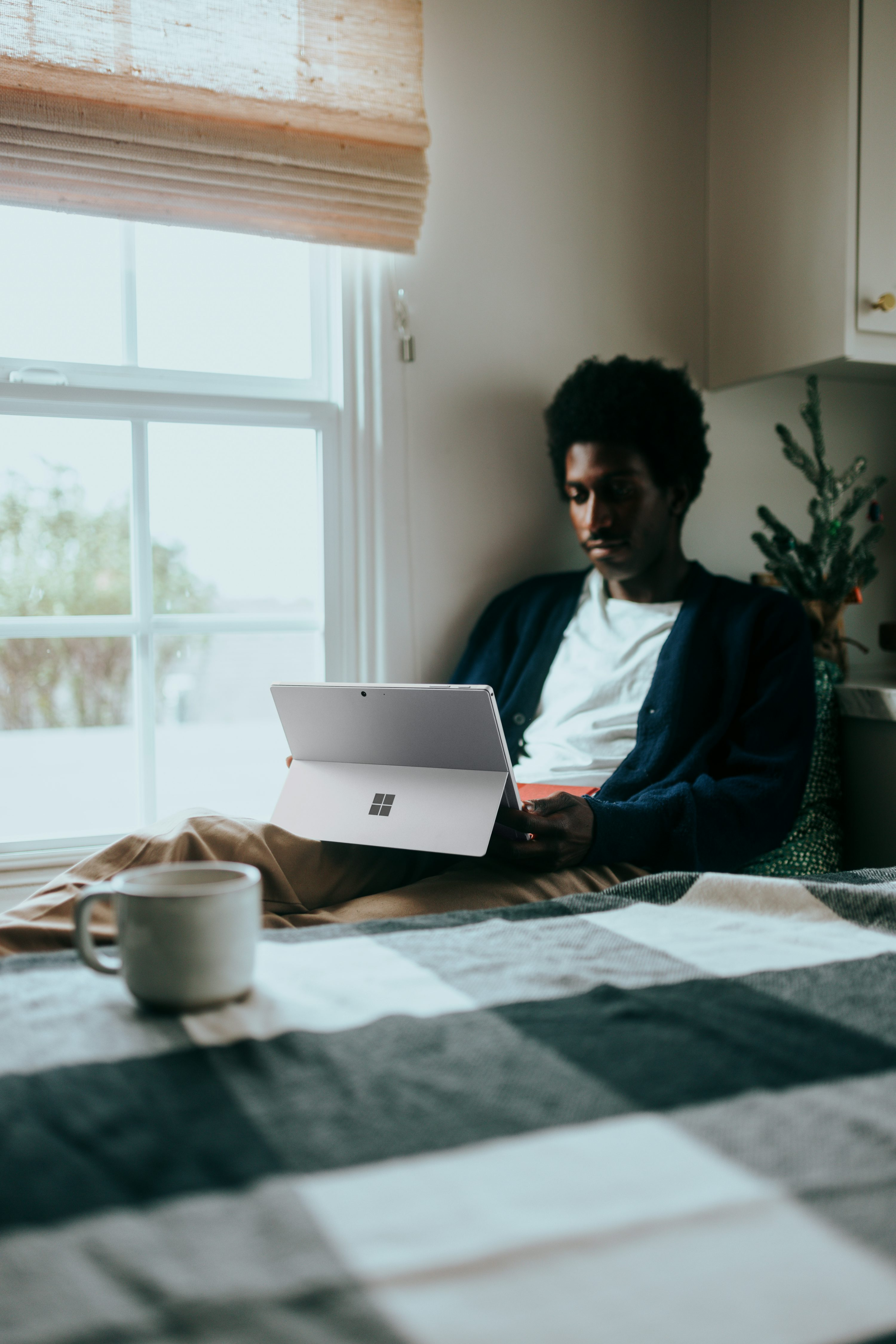
Grounded Optimism Our visual world is bright, authentic, and deeply human. It rejects the sterile look of clinical psychology and the chaotic primary colors of generic preschool brands. Instead, we visualize growth, connection, and emotional intelligence through a lens that is "Safe," "Trustworthy," and "Enthusiastic".
Every image should tell a story of empowerment—showing children, parents, and educators as active agents in their own well-being.
Every image should tell a story of empowerment—showing children, parents, and educators as active agents in their own well-being.

Candid & Authentic
Avoid people looking directly at the camera with forced smiles. Capture "fly-on-the-wall" moments where the subjects are engaged in the activity, not the photoshoot.
Warm & Natural Lighting
Use soft, natural light (window light, outdoor shade). Avoid harsh flash, high contrast, or moody shadows. The environment should feel bright and welcoming (Safe).
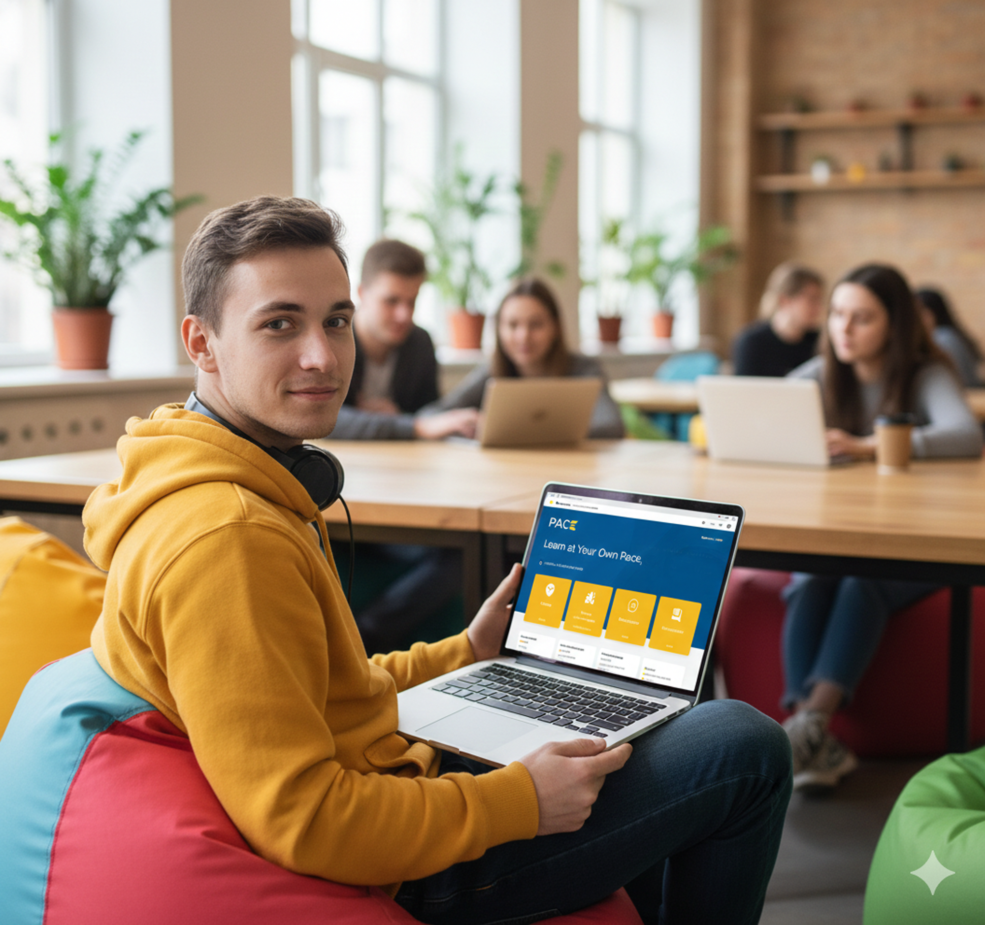
Eye Level Perspectives
Shoot at eye level to create a sense of equality and approachability. Avoid high angles (which can make subjects look small/vulnerable) or low angles (which can look aggressive).

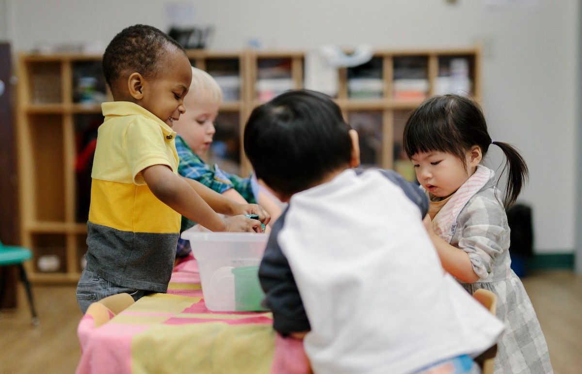

Human Connection & Safe Spaces
Show small groups in "safe spaces" (community hubs, classrooms). Body language should be open, trusting, and collaborative (leaning in, making eye contact, smiling naturally). Note: Ensure diversity that reflects the region (Ukraine, Moldova, Georgia) without relying on stereotypes.